
Evesham Country House - working drawings - more photos to come

This project is one of my largest to date consisting of over thirty rooms. The clients felt daunted by the task of redecorating the whole house and although they had some ideas of how they wanted the house to look were unsure as to how to create a colour scheme that worked for the whole house and reflected the personalities of their large family.
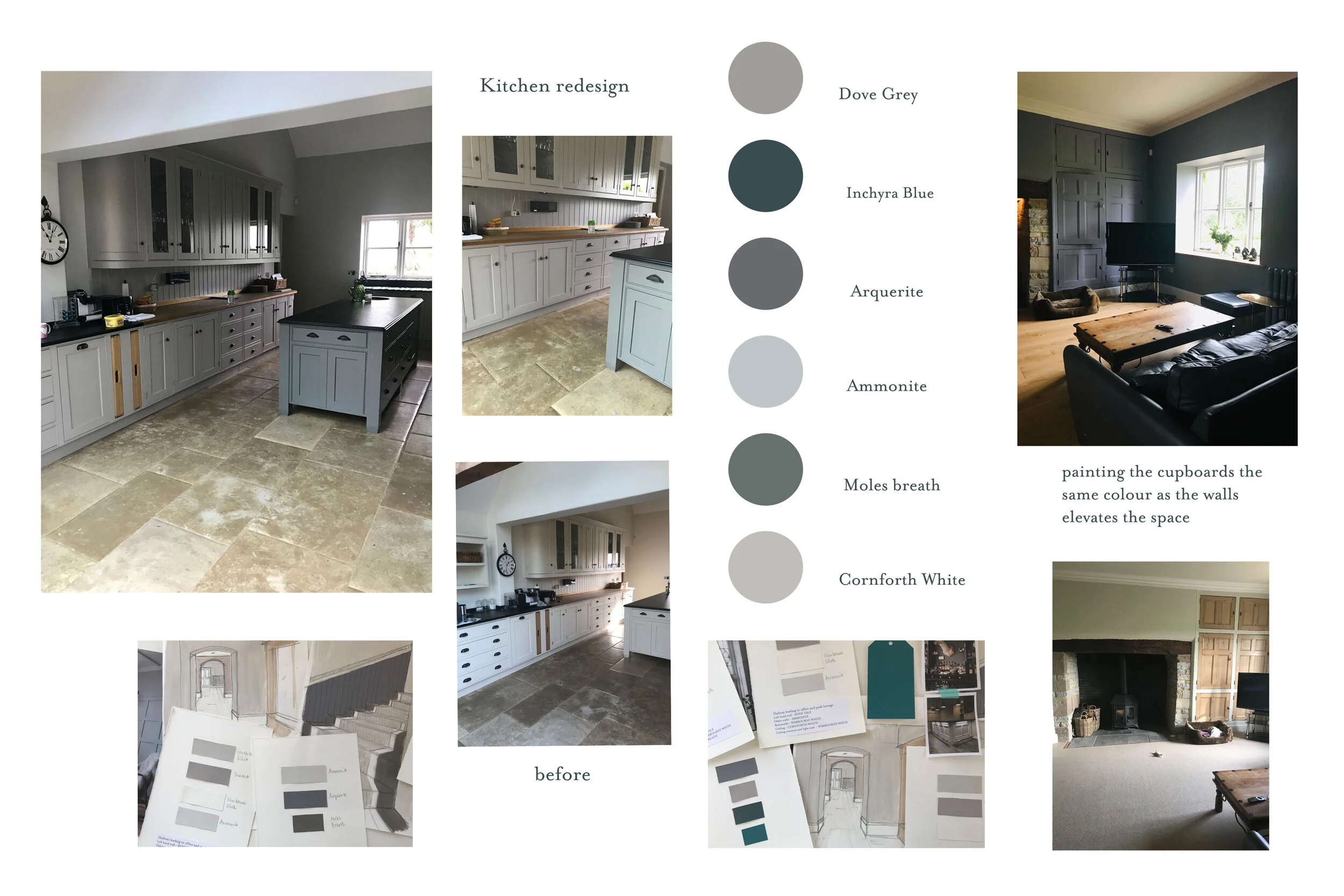
After an initial meeting we established that they wanted the house to introduce more warmth to the house but also wanted it to feel sophisticated and subtle. I suggested Autumn tones with the sophistication of the subtleties of summer. The clients were drawn to soft greys with undertones of pinks and blues but the challenge was to create a scheme that still had some vibrancy and ‘quiet’ drama - (not feeling dull which can happen if there are too many greys). I encouraged them to introduce Inchyra Blue for the study; some stronger tones such as Arquerite for the tv lounge and also Inchyra Blue for the bar area. The main living areas, kitchen, diner and hallways were all then painted with a harmonious scheme of greys, pinks and soft whites.
Master bedroom
This room was large and pretty uninspiring so to immediately add some character and drama we introduced wall panelling behind the bed and painted it in Moles Breath - a warm grey with pink/brown undertones. This helped anchor the bed in such a large space. The rest of the walls were then painted in Cornforth White - another warm grey from farrow and ball. We then added another touch by painting the tv wall in a plaster effect - this served to introduce texture to what was a plain wall.
TV Room
There was very little light in this room and it was also a ‘walk through’ room to other parts of the house. I suggested painting it a dark colour as it would give the room more presence - make you want to stop - and even though the colour Arquerite was quite a deep colour it was also beautiful, and brought a richness and warmth to the room that it desperately needed. We then chose a lighter wood for the floor as this would throw up some light and stop the room feeling too dark. By painting the pine cupboards in the same colour it added a uniformity and immediately updated the cupboards to something far more sophisticated.
Leather sofas, velvet cushions and mirrors all added to the overall warm sophistication of the space.
Study
This room had wall to wall fitted wooden shelving. It was too good to simply throw away so we decided to paint them. I suggested painting the walls and the shelves all the same colour - Inchyra Blue - as this would make he space feel more modern and contemporary. The room had doors opening out onto their beautiful garden so that wall was painted a soft white as this made the room feel lighter. The ceiling also had interesting features so we decided to highlight these by painting it in two shades -

