seasonal colour palettes -applied colour psychology
Why is colour such an important element of design ? How can it help to know what colours we resonate with and why is that of interest ?
In it’s simplest terms - colour is light, light is energy - we feel energy therefore doesn’t it make sense to believe that we also feel colour even if we don’t realise it. I’m sure you’ve experienced times when a particular colour has caused a physical response - it may be a room painted in a particular colour makes you feel uneasy; you might have a particular colour jumper that you always feel uncomfortable wearing but you’re not sure why; if you were given a plate of blue food its likely your first reaction would be uuurgh ! we all respond to colour at a subconcious level and that is the basis of colour psychology.
In the 1970s Angela Wright developed a theory called “The Wright Theory” which explored ideas around the tonal differences in colours and how these differences cause a different response in different people. She realised that although it was well known that different hues had different psychological characteristics nobody had looked at how the different tones may also have different characteristics.
Through a series of experiments she discovered that
-as humans we all respond positively to colours that harmonise - even if we don’t particularly like the colours
-that certain personality types were drawn to certain tonal groups of colour
Based on the teachings of Carl Jung she came to the conclusion that all colours can be divided into four tonal groups of colour and each group can be aligned with a personality type. Therefore by knowing a personality type you could predict with some accuracy the group of colours someone would be drawn to.
This information is particularly useful in design as it means colour can be used to affect the viewer in a positive or negative way - branding, interior design, fashion design etc
“The psychological properties of the basic hues and the differences that the tonal variations in combination with specific shades will create visual harmony and a predictable psychological effect”
The Wright Theory - Angela Wright
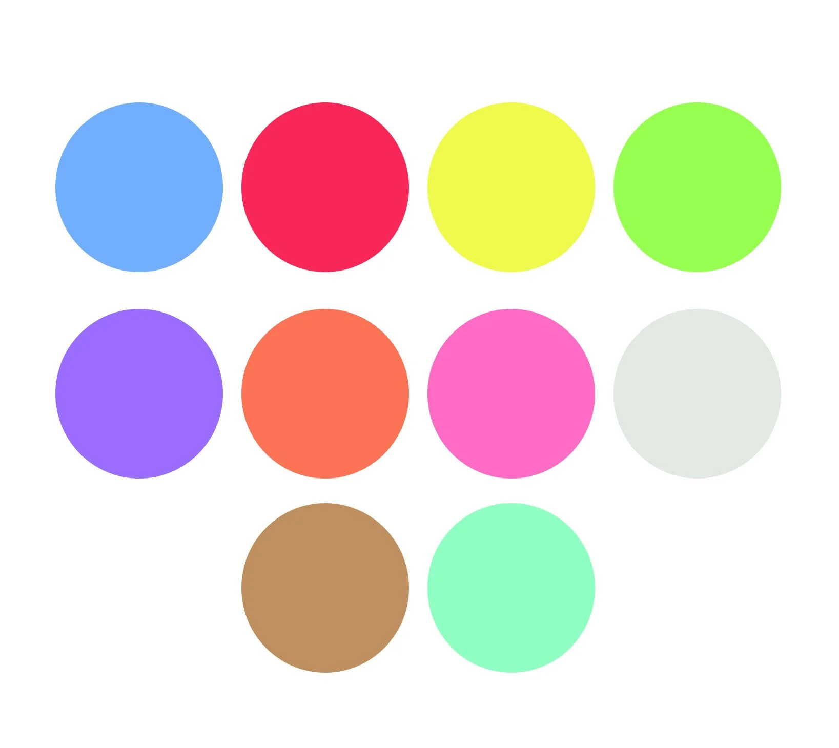
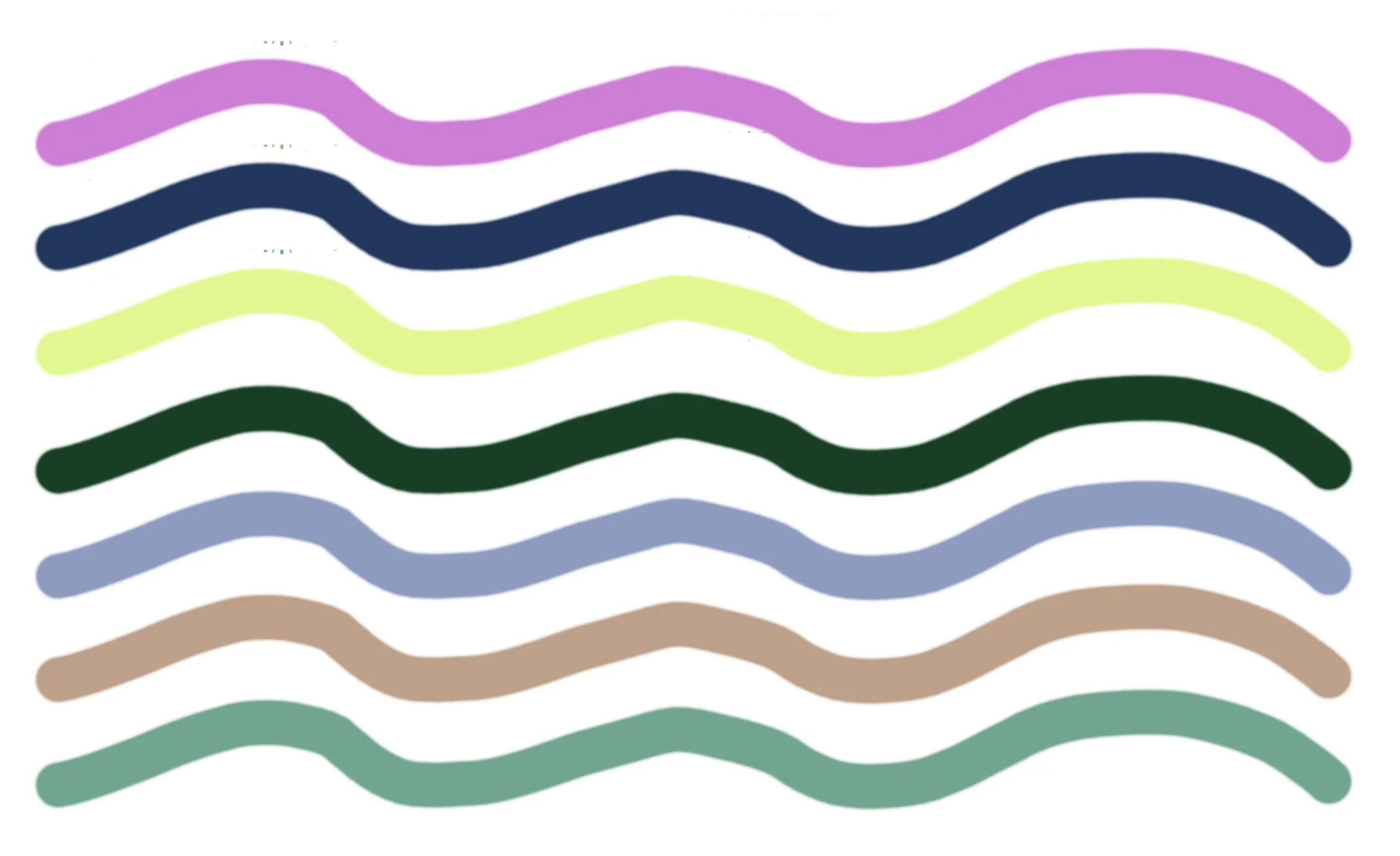
Below are the seasonal colour palettes - unfortunately the screen has distorted the tones so they all look similar here. I hope the descriptions help.
morninglight
clear, delicate warm colours - scarlet, coral, peach, daffodil yellow, emerald green , sky blue, lilac apply
firelight
warm, intense and fiery - tomatoe red, burnt orange, olive green, rust, butter yellow, teal
dreamlight
cool tones that contain more grey, also delicate but not necessarily light - soft and subtle. Maroon, sage, dove grey, lavender, delphinium
starlight
clear and strong with no subtleties - very dark, very light or very intense - black, white, crimson, lemon, jade green, ice blue, violet


